Kidsync
A care-management platform that helps families of children with special healthcare needs hand off care safely, and stay in the loop even from afar.
A nine-month "Shark Tank" for product
This was the capstone of Northwestern's Master of Product Design & Development Management (mpd²) program. Over nine months, professionals from different fields team up to design and pitch a disruptive product to a panel of judges and VC investors. It asks for the whole range: research, strategy, cross-functional collaboration, and a pitch that lands.

Meet Elliot
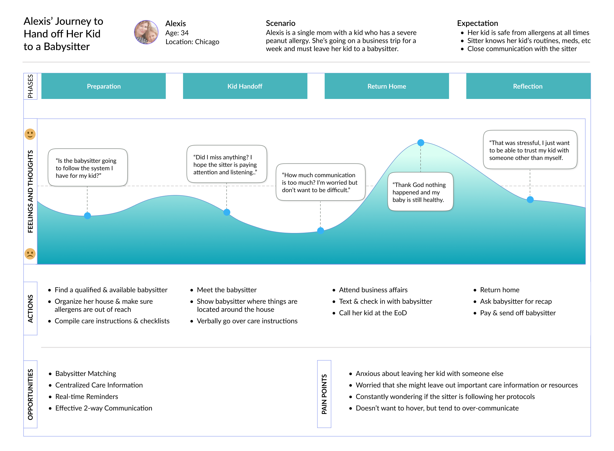
Elliot reached for his babysitter as he gasped for air. He was four, had a severe peanut allergy, and was unintentionally given a Butterfinger. In the panic, his babysitter failed to administer an EpiPen on the way to the ER. He made it just in time. Luckily, he's now a bright eight-year-old. However, that day changed his parents forever.
Every time they have to entrust their child to someone else, the anxiety comes back. And they're not alone.

Parents of children with special healthcare needs rely on a patchwork of workarounds when handing off care to babysitters, in-laws, relatives, and teachers.
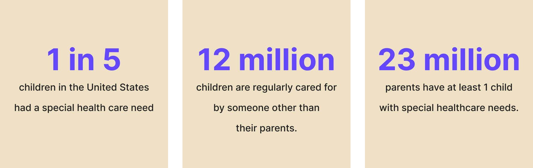
Critical information gets lost every time care changes hands.
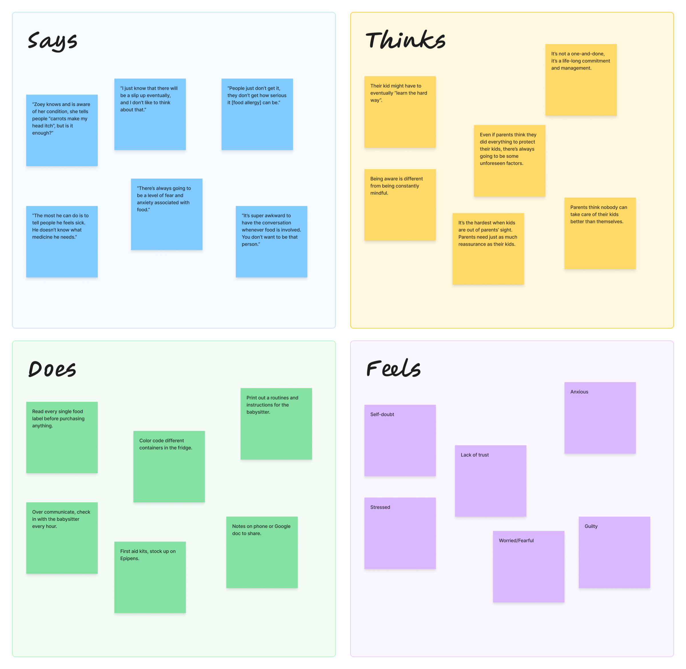
What parents actually do today: handwritten lists, color-coded containers, frantic texts. None of it scales, and none of it holds up in a real emergency.
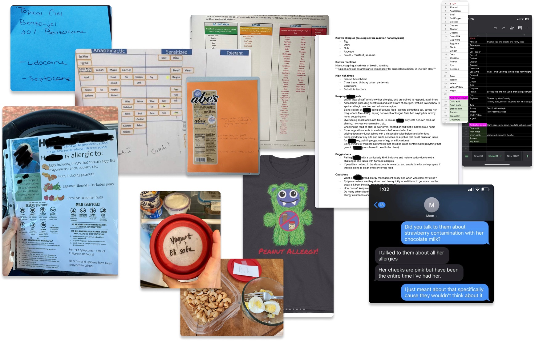
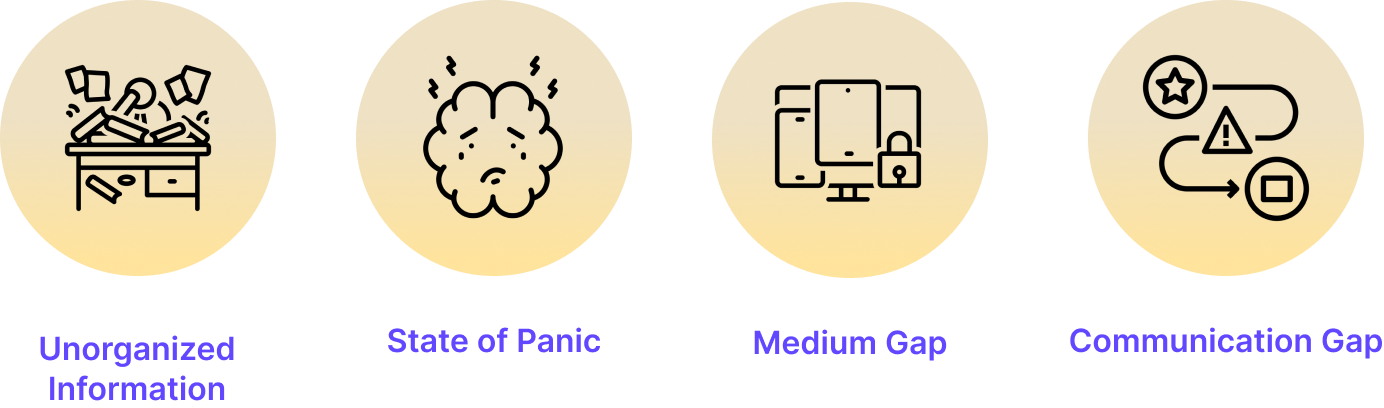
The same breakdowns happen in nearly every handoff.
Scattered information. No confirmation loop. Wrong medium. No fallback plan.
The Solution
Three capabilities map to the three things that broke in a handoff: information you couldn't rely on, confirmation that never reached the parent, and a support network that didn't exist.
All-in-one care profile
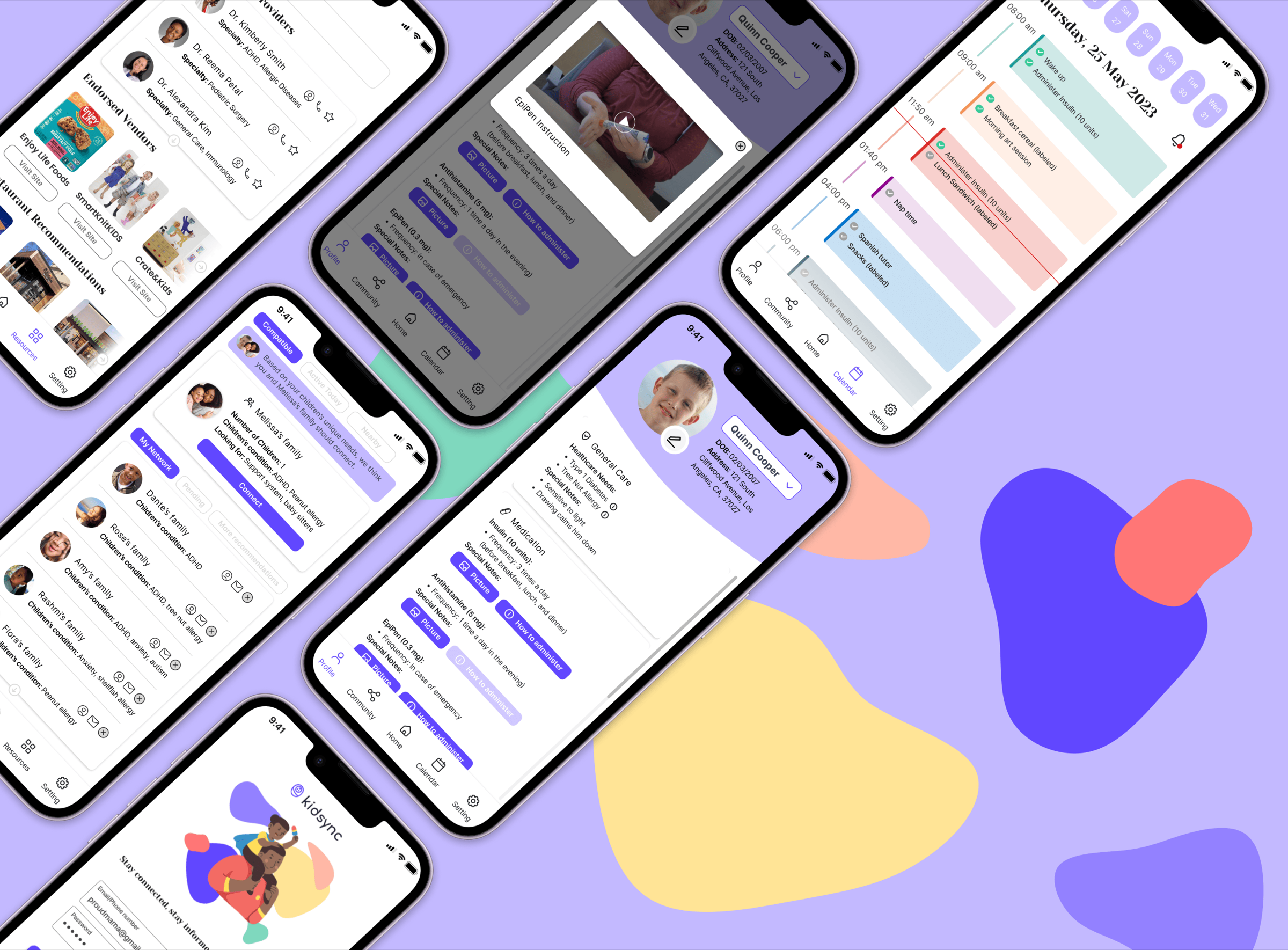
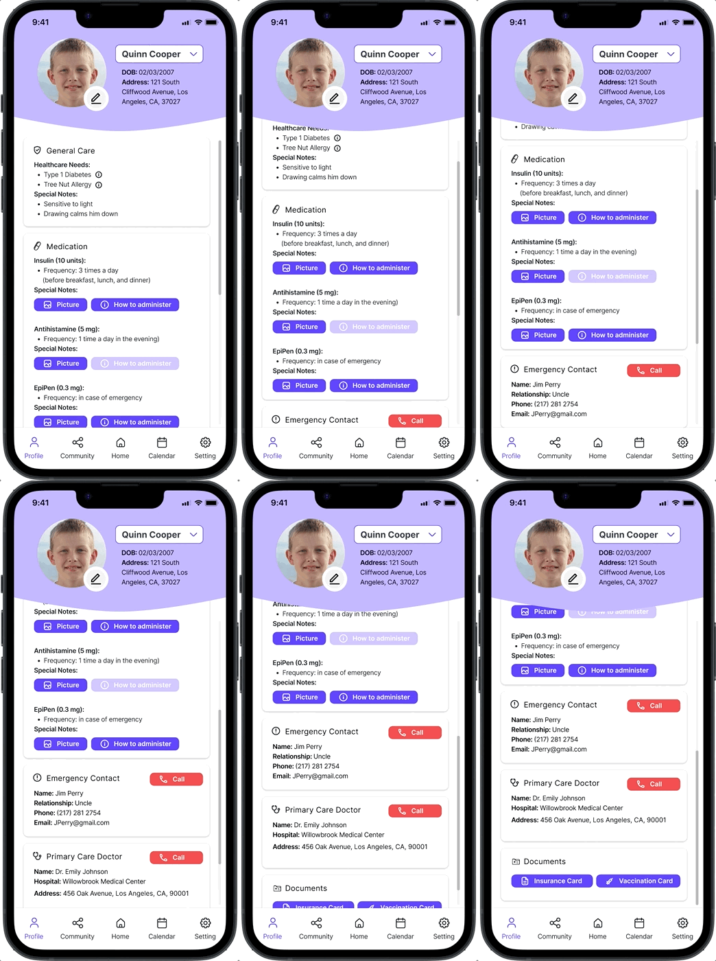
Parents build a complete profile: conditions, medication instructions, documents, emergency contacts, and care tips. Authorized caretakers get everything at a glance, with media-rich medication guides they can follow under pressure instead of searching in an emergency.
Medication guides & document access
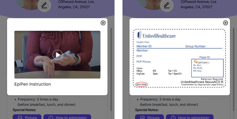
Photo and video guides let caretakers administer medication confidently. Medical history, insurance, and vaccination records are one tap away.
Interactive checklist with calendar
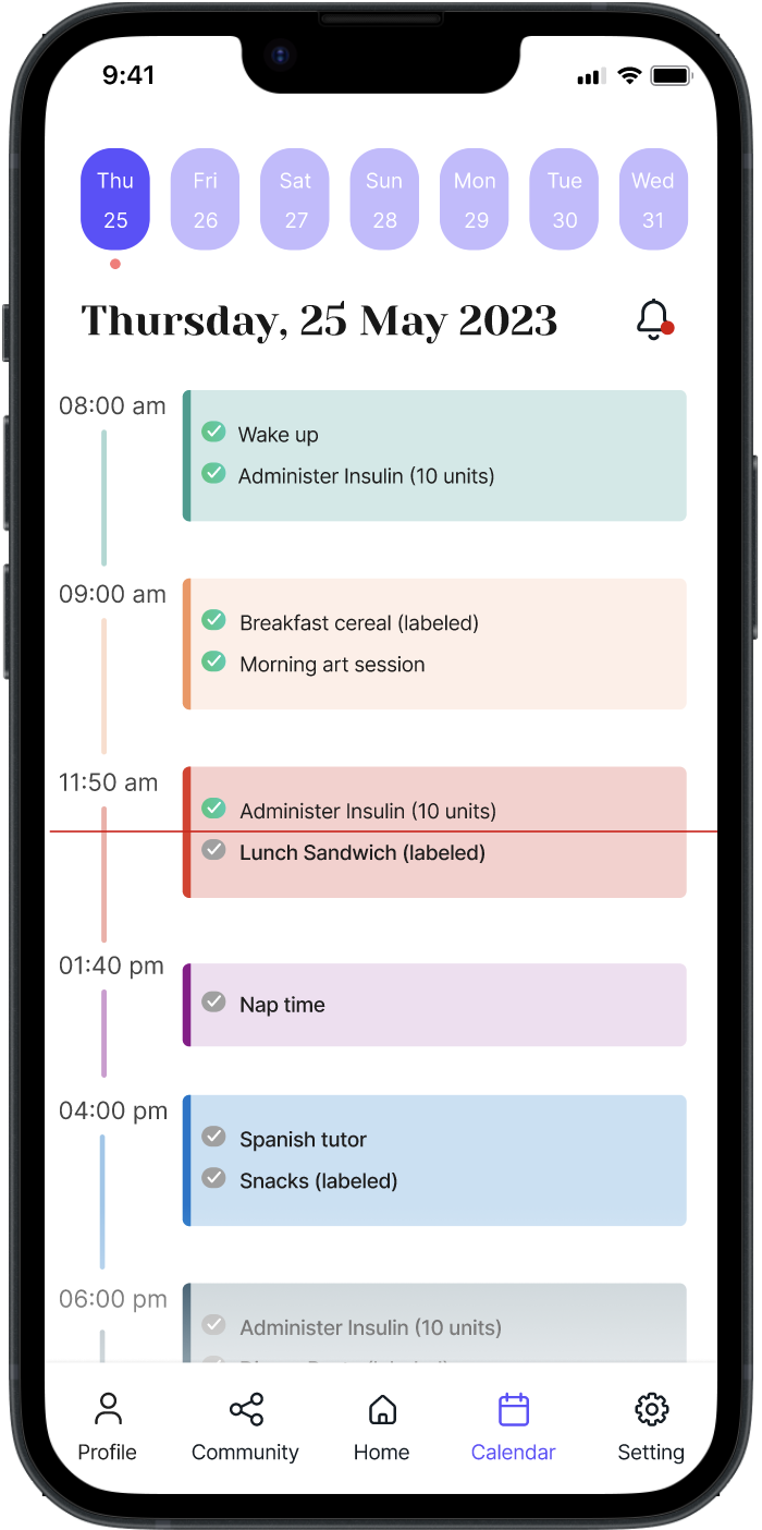
Caretakers check off time-based tasks and send real-time confirmation back to parents, closing the anxiety-driven communication gap without the parent having to chase updates.
Household matching & community
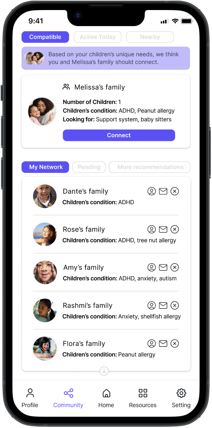
Kidsync connects households with similar care needs, matched on children's conditions rather than just proximity, into a trusted network for support and babysitting, so parents stay connected and informed.
Understanding the problem before designing anything
User identification
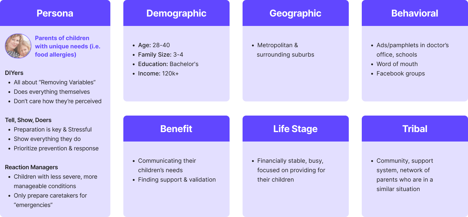
I used consumer segmentation, personas, and journey mapping to avoid starting from assumptions. The goal was to identify real needs across a range of parent types and care scenarios.
Three segments emerged: DIYers, Tell-Show-Doers, and Reaction Managers. The product had to work for all of them.
Preliminary interview
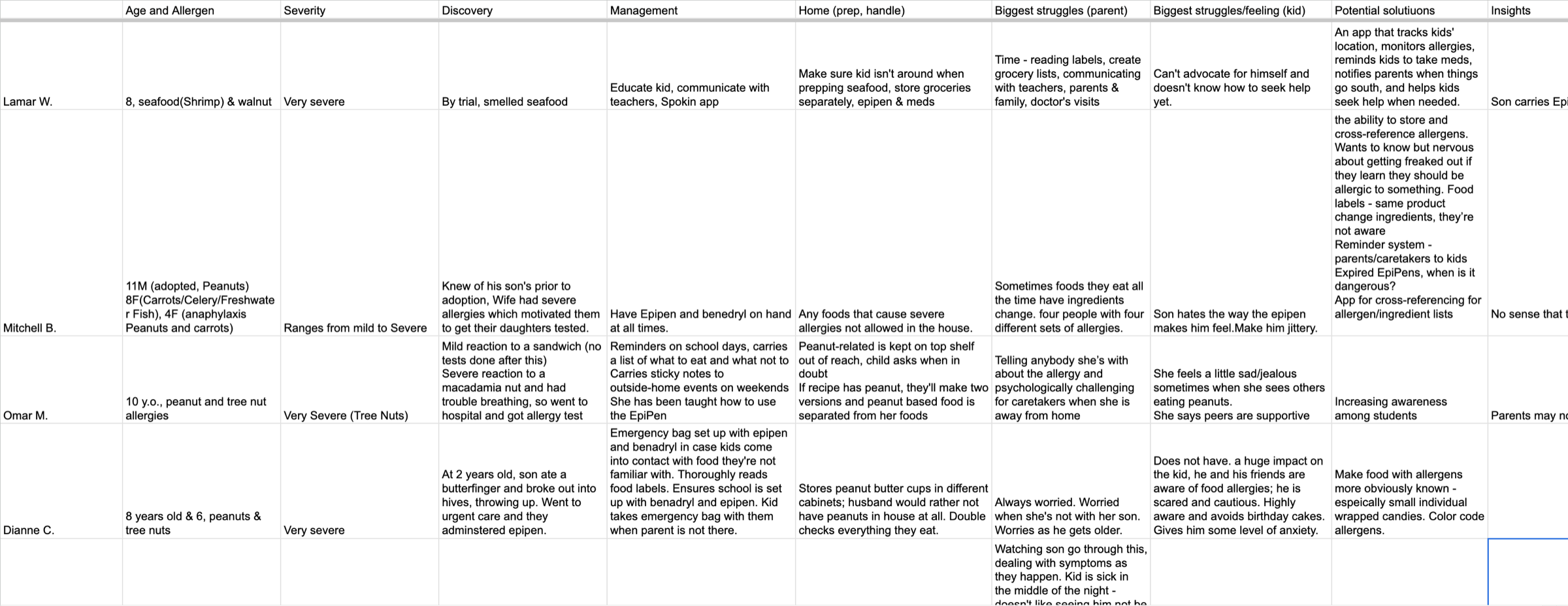
I scripted the guide, led parent interviews via Dscout, and synthesized results to validate assumptions, surface friction, and gauge willingness to pay.
- ⭐️ Proactive measures
- ⭐️ Peace of mind
- ⭐️ Effective communication
From insight to product direction
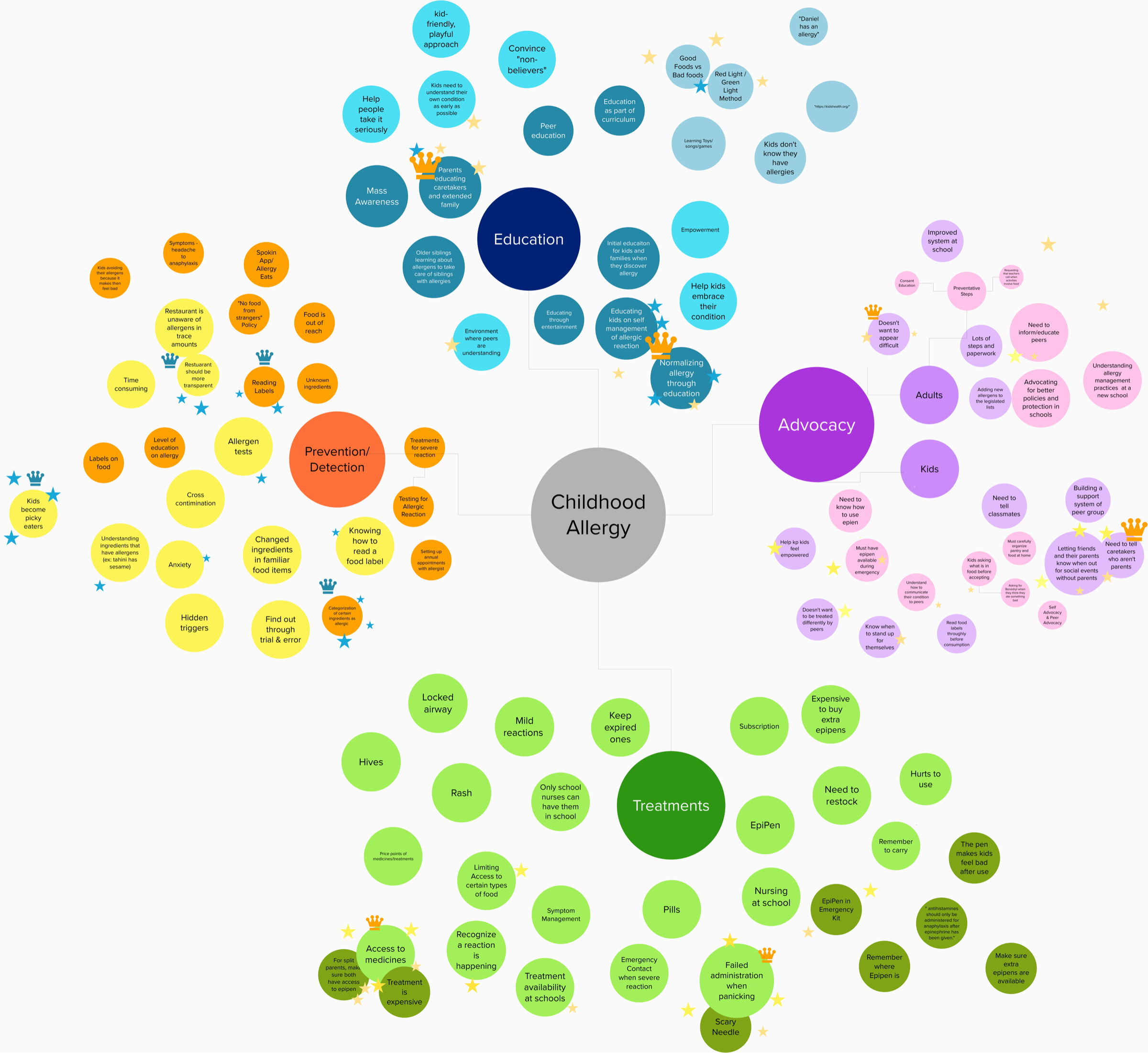
We mapped the childhood allergy space across Education, Prevention, Advocacy, and Treatments to find where design had the most leverage.
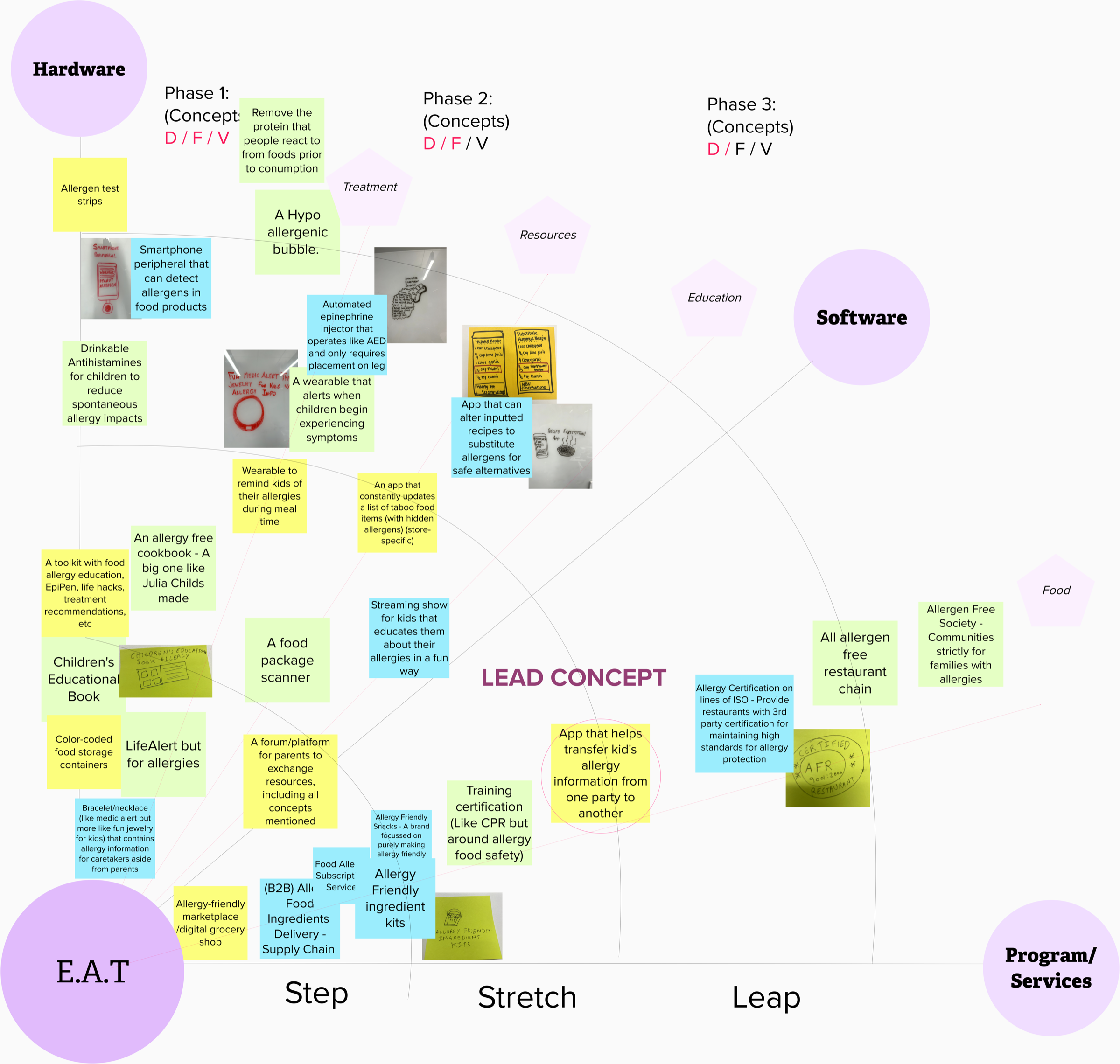
We ranked dozens of concepts across desirability, feasibility, and viability. One rose to the top: a secure way to hand off a child's care information to whoever is watching them.
No one owns all three functions
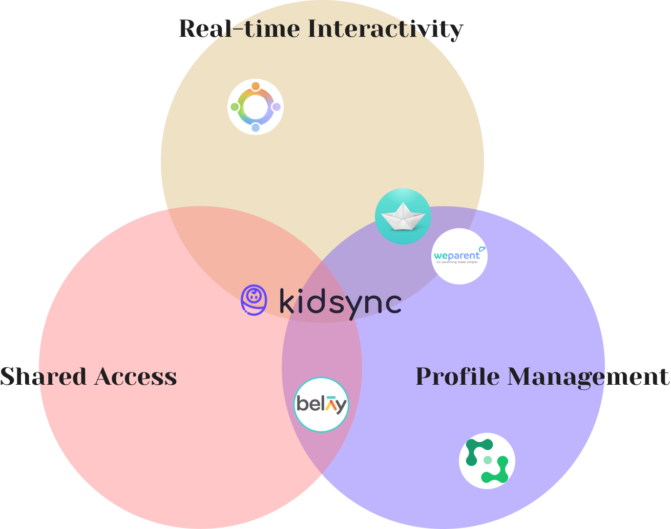
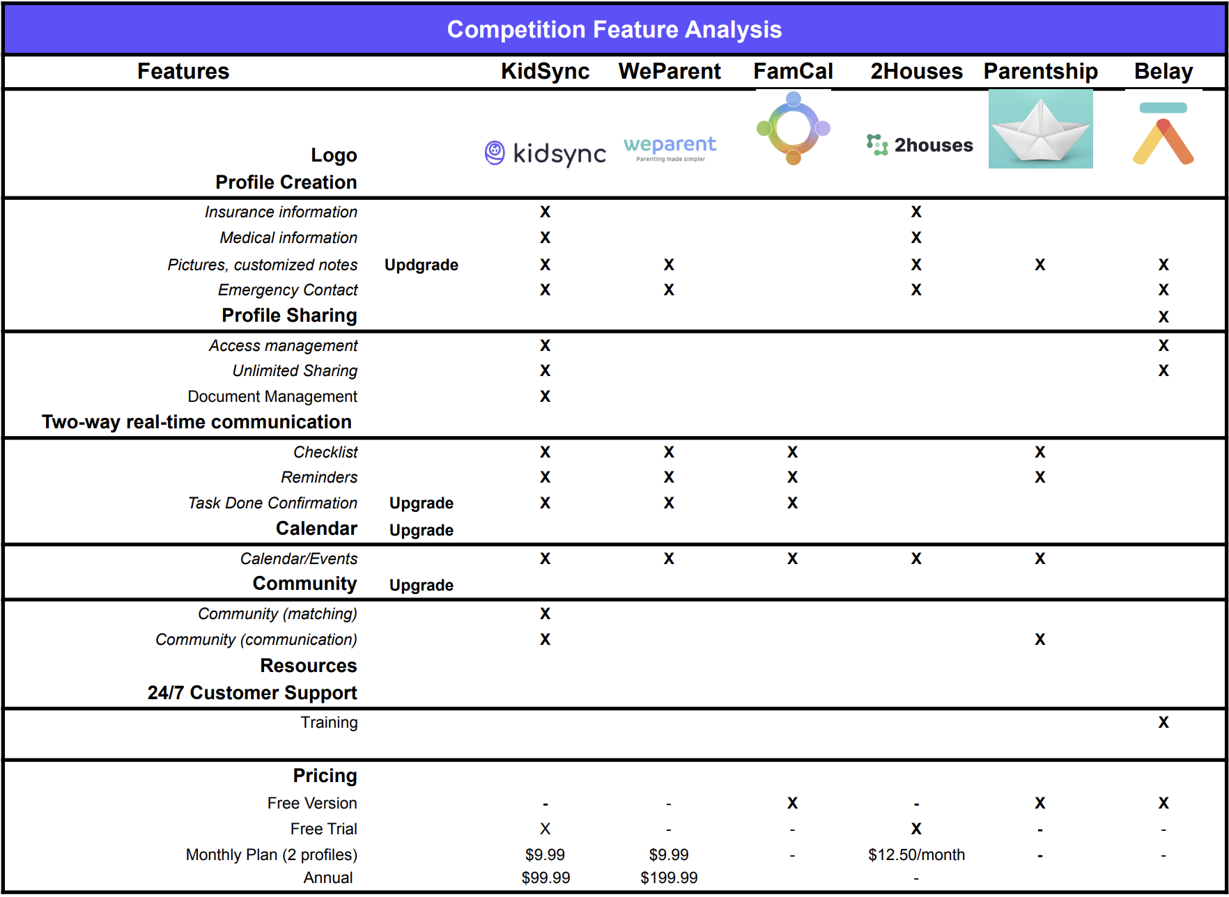
Most apps here cover one or two of three things: real-time interactivity, shared access, and profile management. Kidsync was built to do all three.
From storyboards to a shippable flow
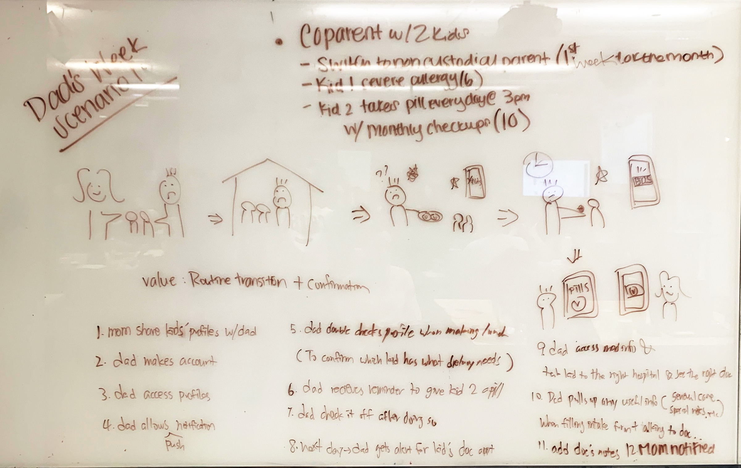
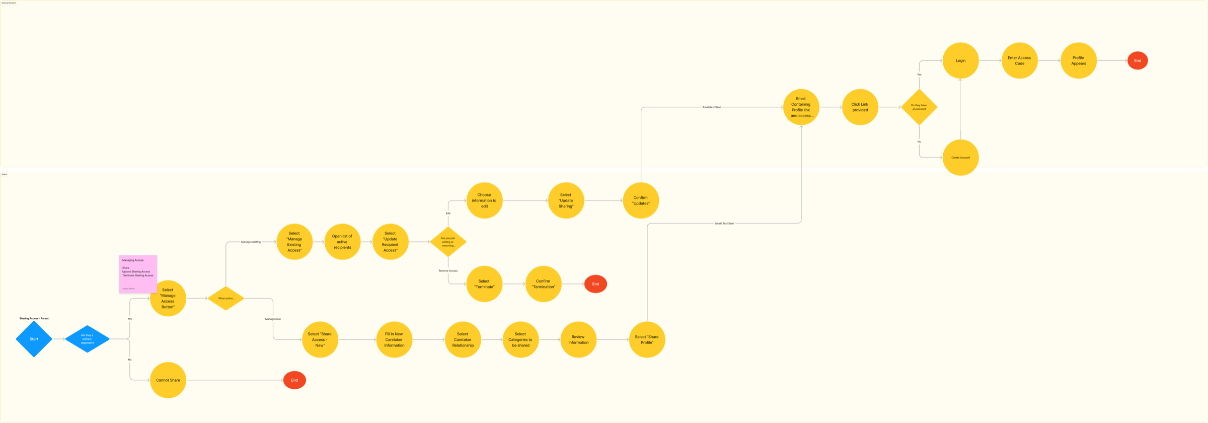
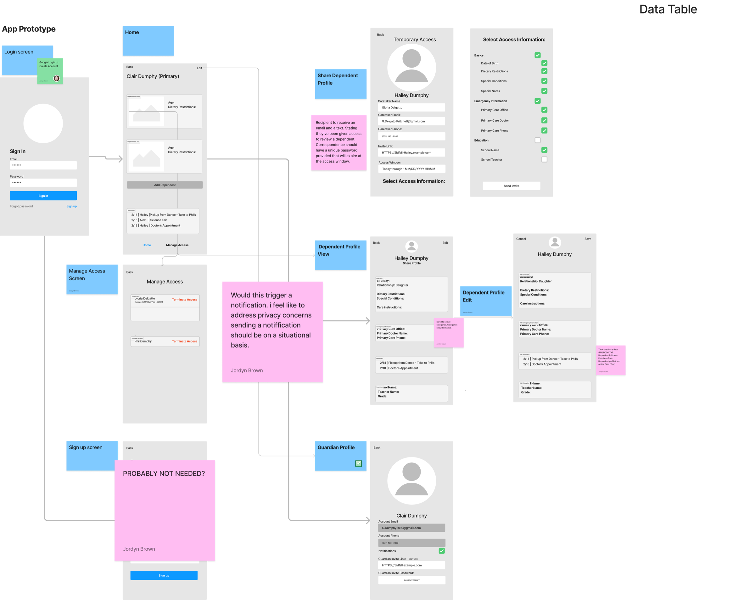
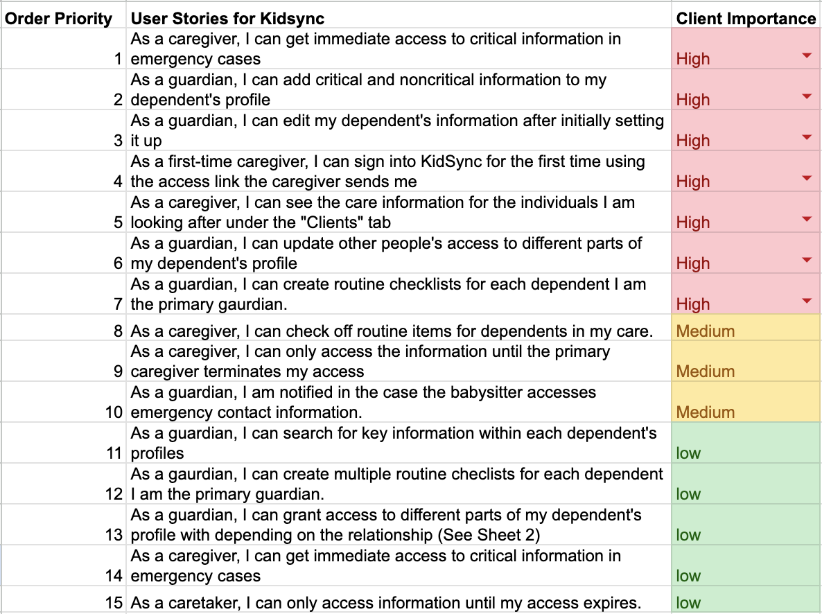
I started with storyboards, working through each parent scenario before opening a design tool. Those sessions gave me a user-story backlog, a master flow, and lo-fi wireframes I tested and refined into high-fidelity screens.
Three decisions that shaped the product
Refining the information hierarchy
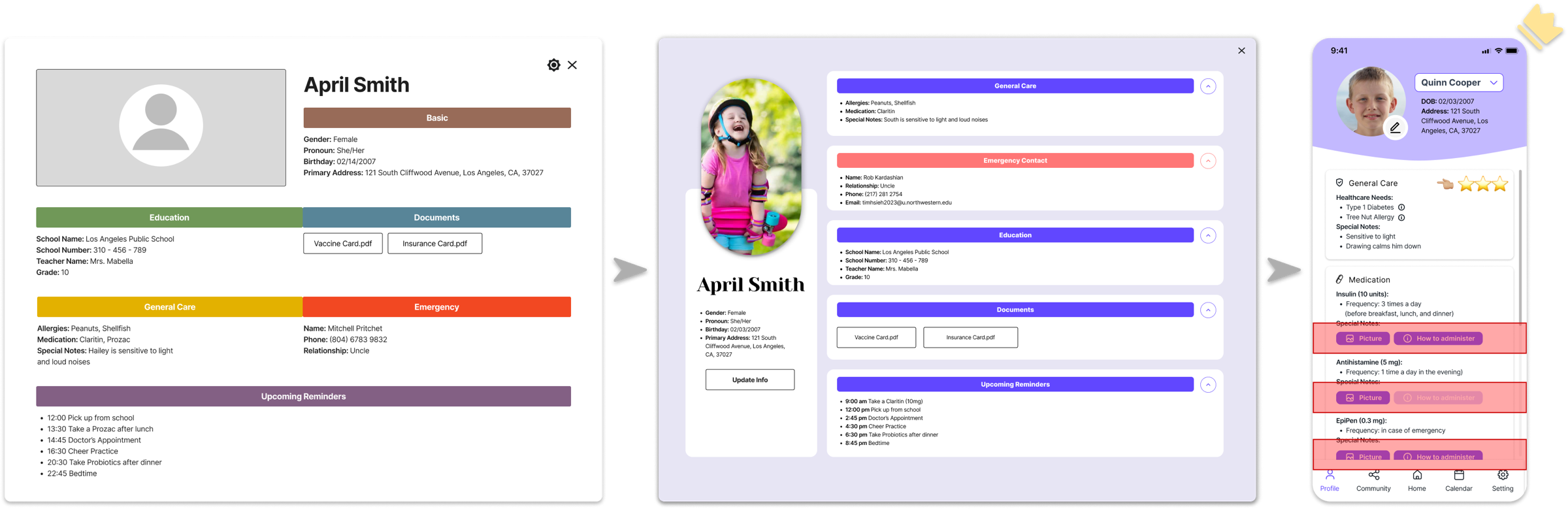
The profile first led with demographics and education, then care instructions, documents, and contacts. Research showed that in the moment, a babysitter needs the general care information most, so we reordered it and added photos and video for medication, putting the life-saving instructions first.
Prioritizing mobile accessibility
We first pictured Kidsync as a web app, given how much information it had to hold. Testing pushed back: a web app isn't immediate enough for the real moment, a panicked babysitter grabs their phone, not a laptop. So we went mobile-first.
Enhancing data security
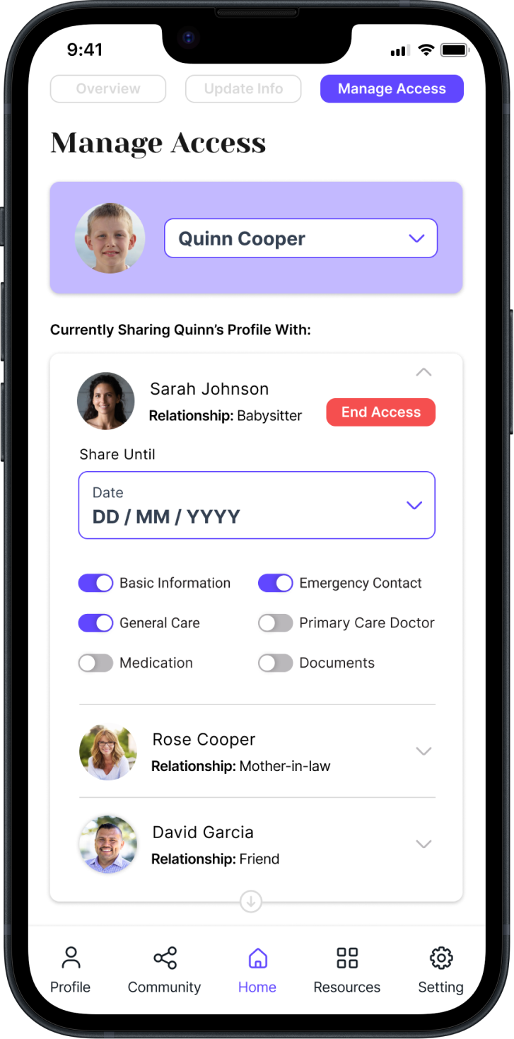
Some parents worried a sitter might keep access after the job ended. So we added granular control over what gets shared and for how long: parents pick exactly which categories a caretaker sees, and access expires on its own.
Users wanted it before it existed
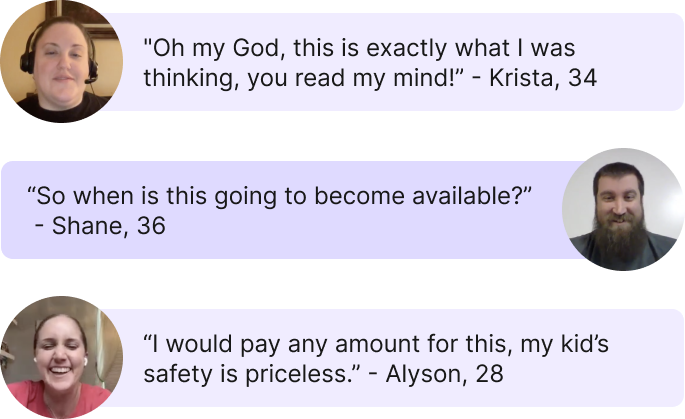
When we walked parents through the concept, the response went past polite approval, people asked when they could get it and said they'd pay right away. That kind of unprompted reaction was the strongest signal of fit we got.
Kidsync took a complex, emotionally charged problem from primary research through segmentation, competitive analysis, and end-to-end design, and landed on a focused concept people wanted before it existed. The hardest call wasn't visual. It was narrowing a broad "childhood allergy" space down to the one handoff moment where design had the most leverage.
Where Kidsync goes from here
Near term, the focus is launching and growing a B2C base among families of children with special healthcare needs. From there the architecture opens naturally to pet care and elderly care, and eventually a B2B move: partnering with care facilities, schools, and hospitals.